/ Project Overview
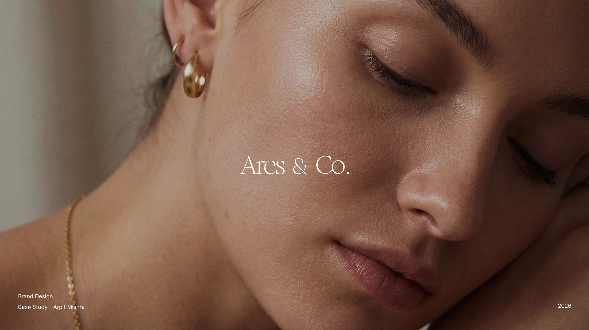
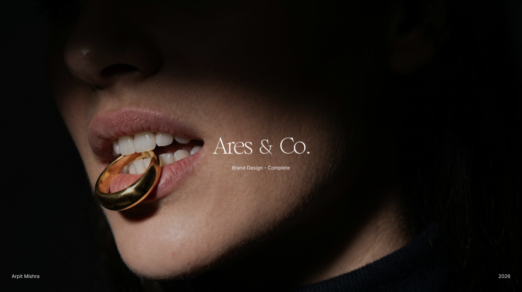
Ares & Co. was conceived for a jewelry brand that needed more than a decorative logo or a polished aesthetic. The brand needed a complete system that could communicate weight, restraint, and value across every touchpoint.
/ The Problem
The luxury jewelry space is full of visual codes that repeat themselves. The challenge was to design a language that felt original without losing authority, and premium without leaning into cliché.
/ The Direction
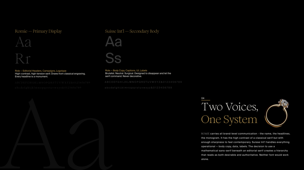
Build a complete brand architecture that includes mark, typography, color, photography direction, and digital expression. Create a system that feels quiet, but never weak.
/ The Strategy
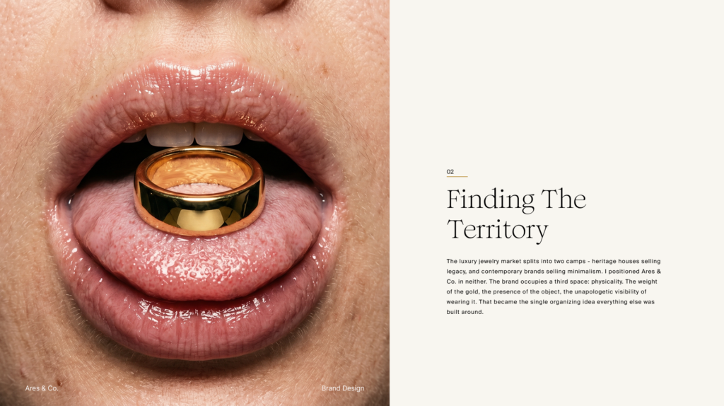
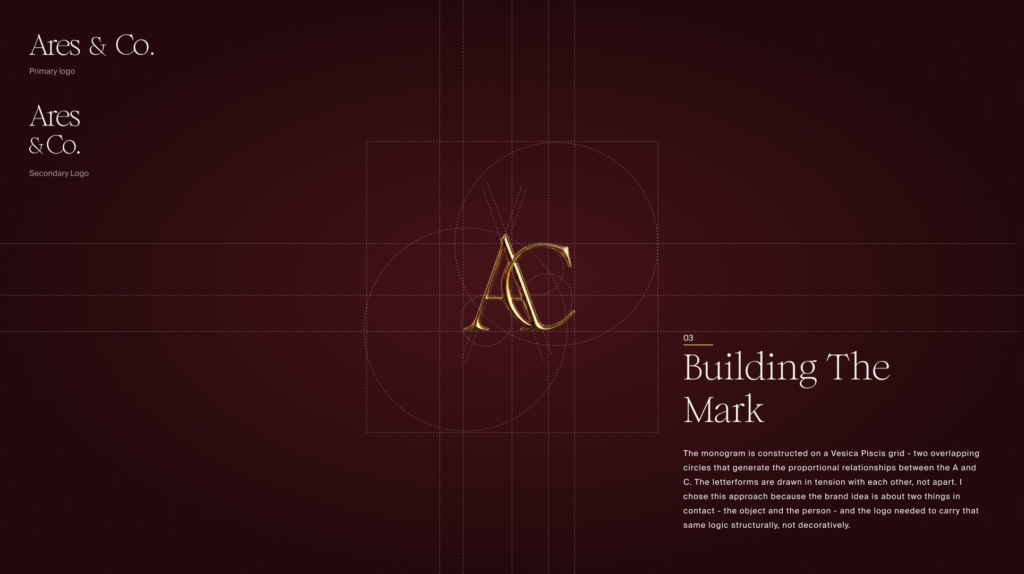
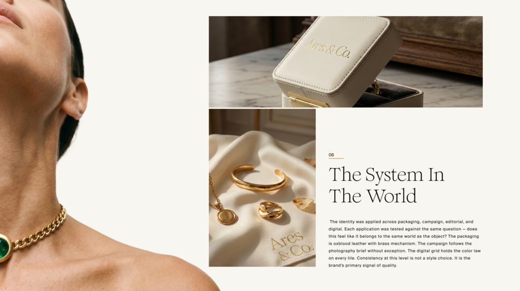
The identity was built around a single idea: physical presence. The monogram, type system, color palette, and imagery all support that idea with discipline. Typography carries the voice, gold acts as the signal, and negative space gives the brand its tension. Nothing exists just to decorate the page.