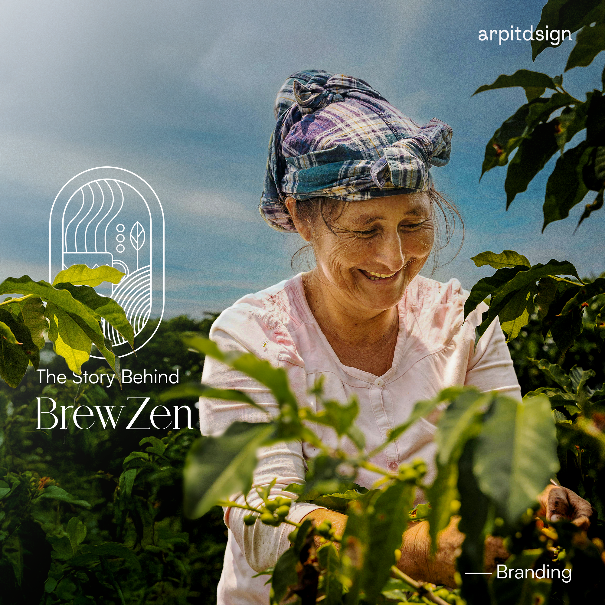
/ Project Overview
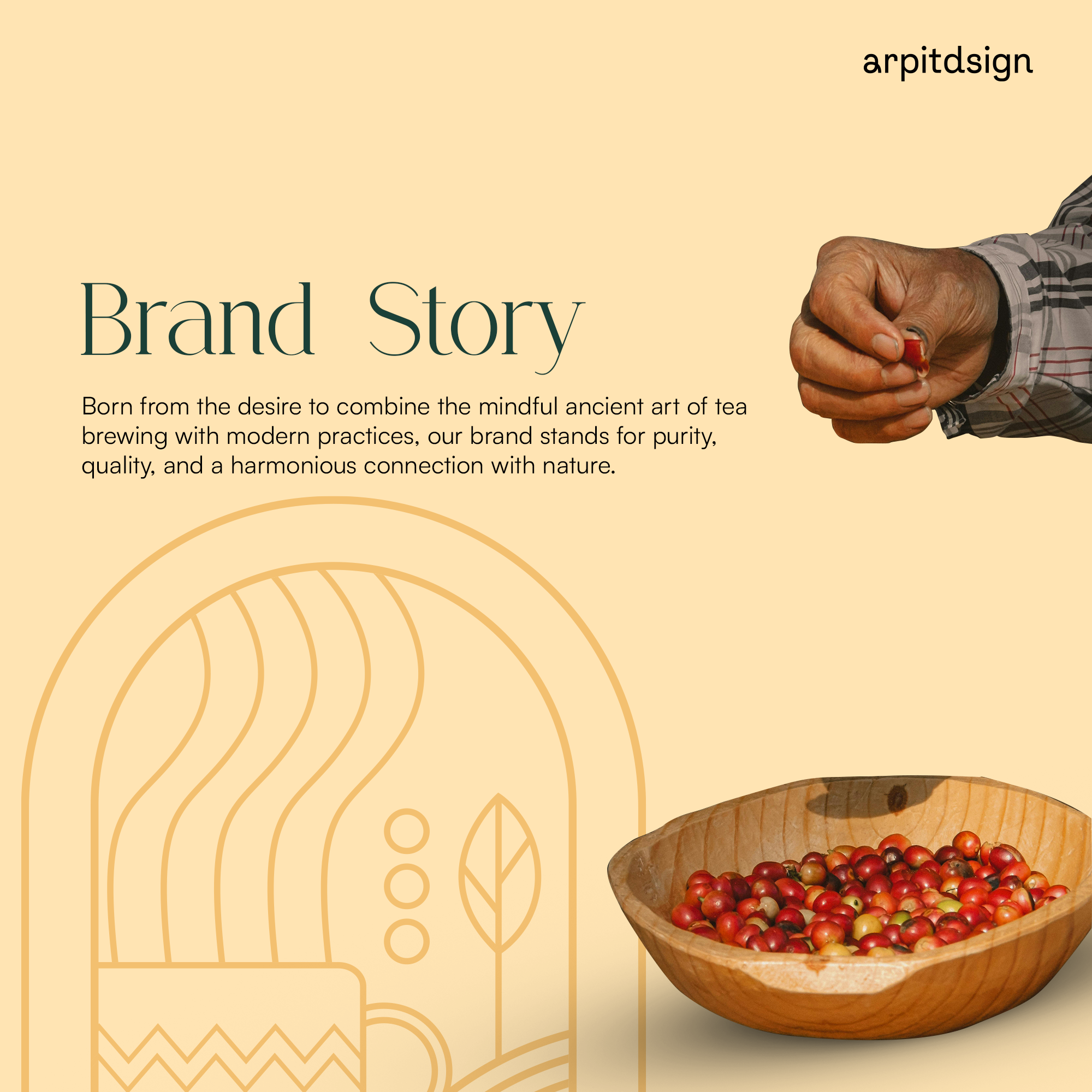
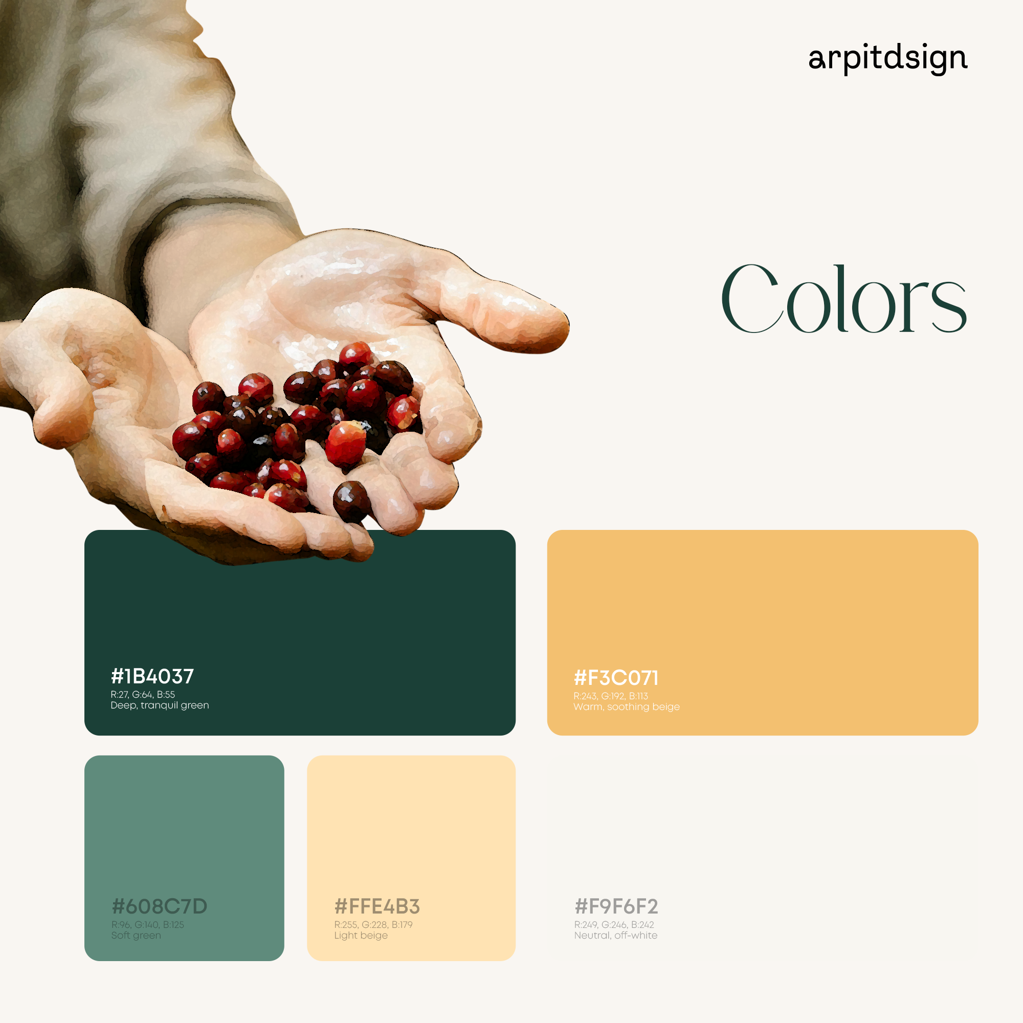
BrewZen came to the table with a clear truth: the product had depth, but the market language did not. Most coffee brands in the category leaned either too Western, too rustic, or too generic. The challenge was to build a system that felt refined, local, and emotionally distinct without losing commercial clarity.
/ Problem
The category was crowded with visual sameness. Indian coffee brands often borrowed from imported aesthetics or defaulted to familiar “warm café” clichés. BrewZen needed a language that felt calmer, more deliberate, and more original across every touchpoint.
/ Direction
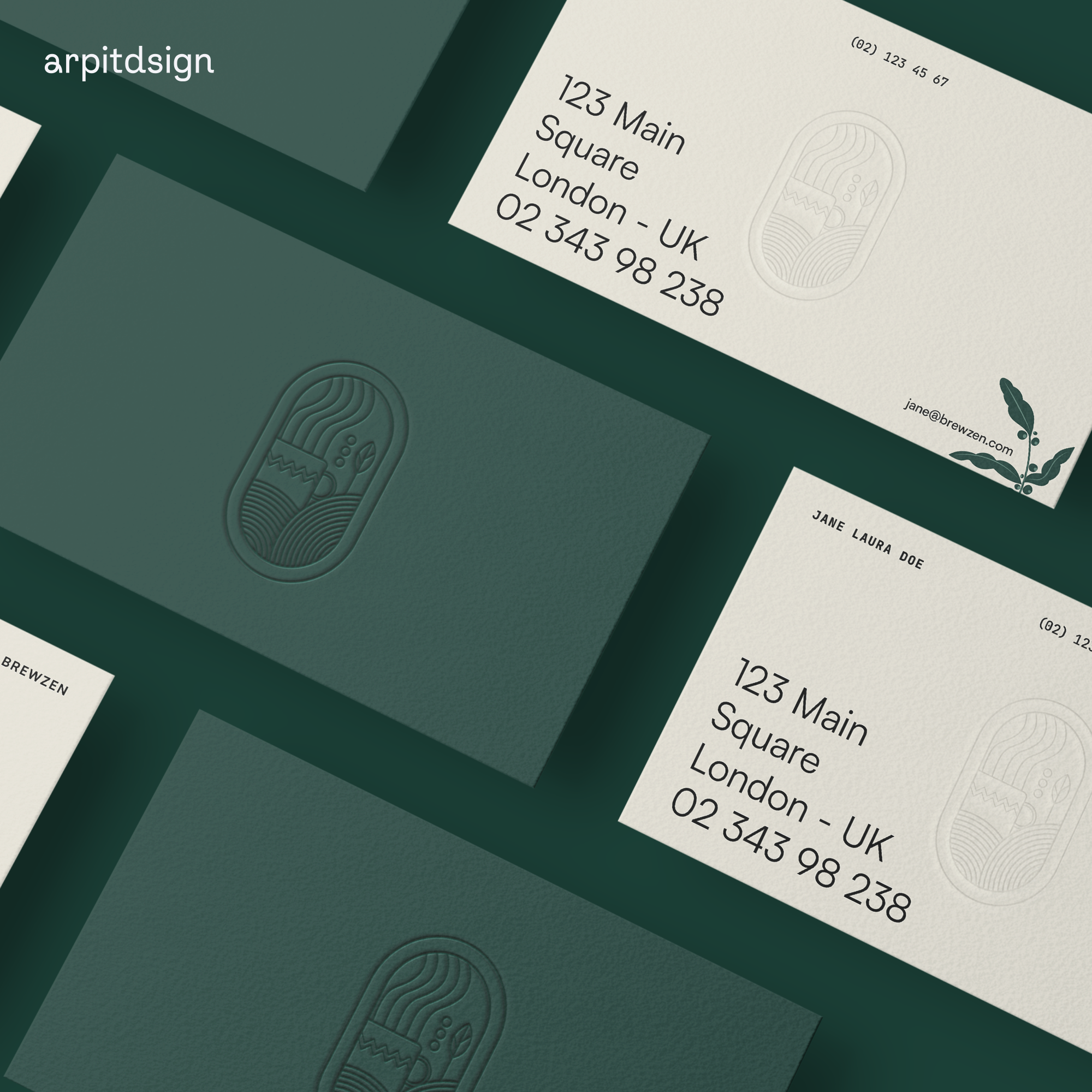
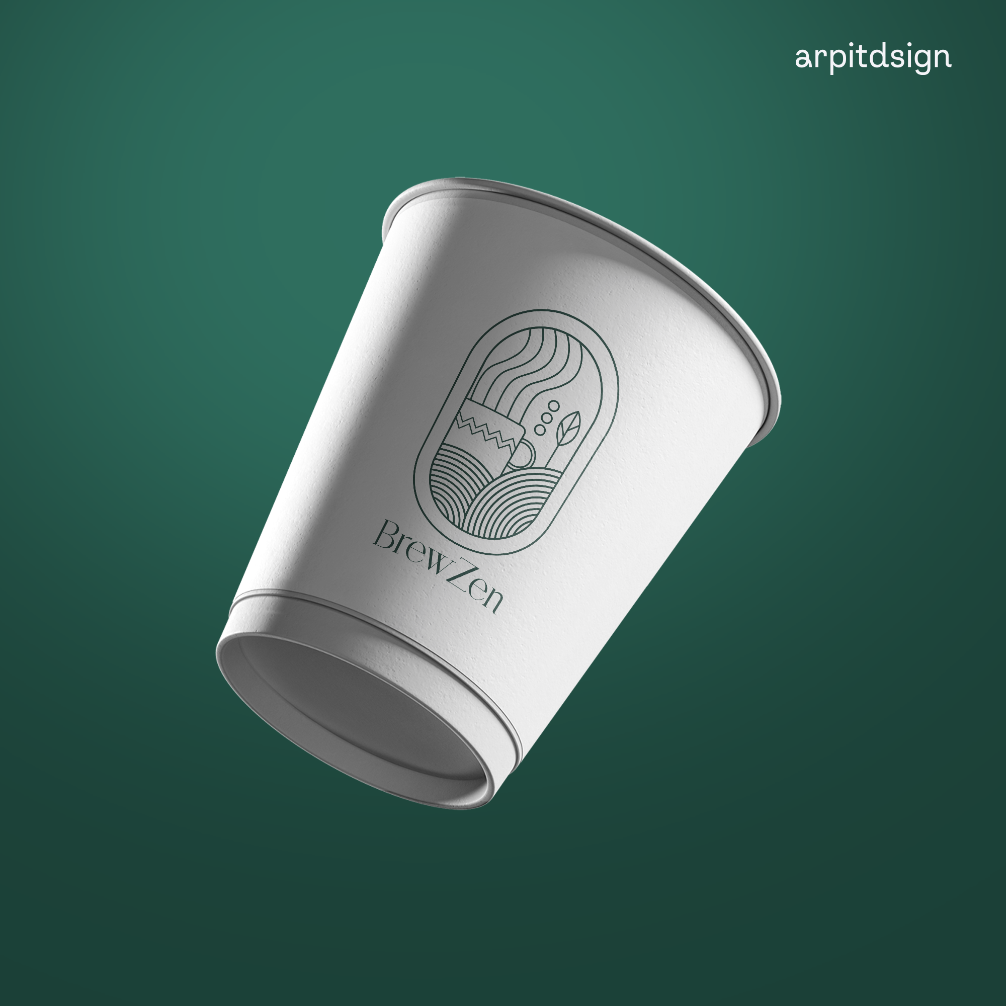
Create a brand identity that reflects Indian coffee culture with discipline and depth. Build a visual system that works across packaging, signage, digital, and social without losing consistency or character.
/ The Strategy
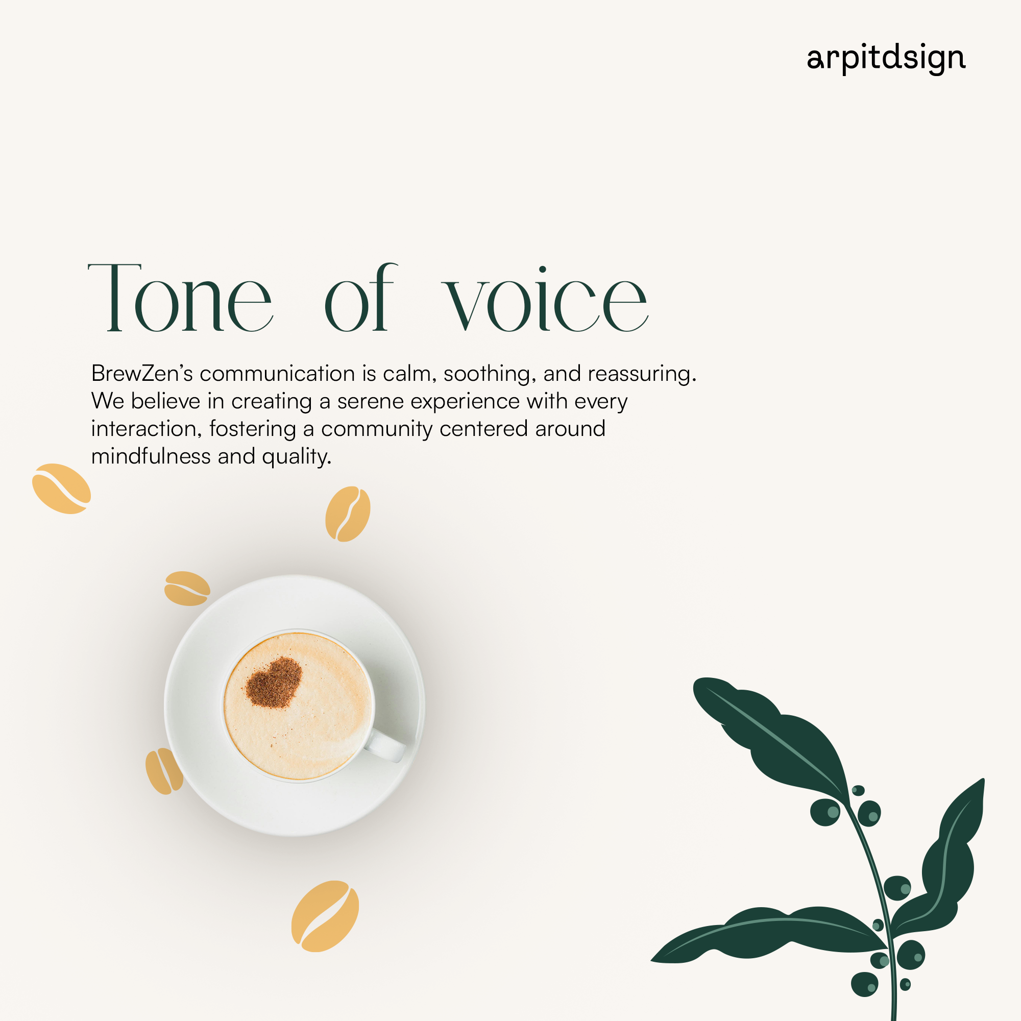
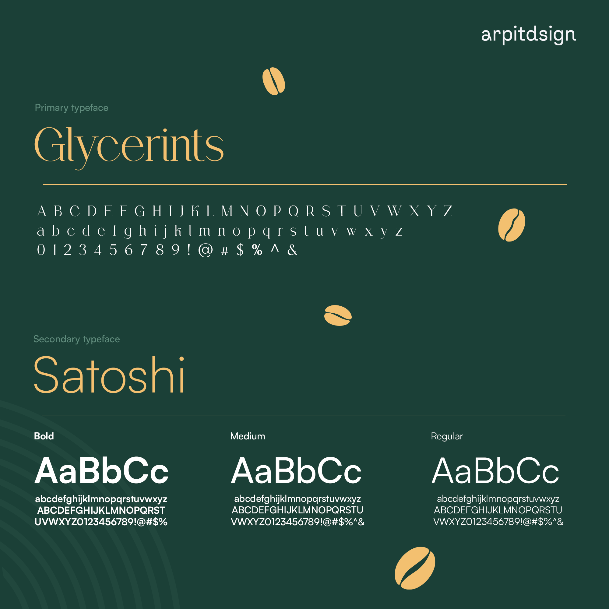
The identity was built around a restrained palette, clean typography, and a visual rhythm that feels composed rather than decorative. The aim was to create a brand world that feels thoughtful at first glance and trustworthy over time. Every element was designed to support the core idea: coffee with origin, presence, and intent.