/ Project Overview
Cyber security branding in India defaults to two modes. Corporate grey that signals caution, or aggressive dark tech that signals threat. Kosmonel needed neither. They protect systems at scale but their philosophy is fundamentally about clarity and control. The identity needed to carry both of those things at the same time.
/ Challenges
The biggest challenge was avoiding every visual cliché the cyber security industry runs on. Shields, locks, circuit boards, dark backgrounds with green text. Kosmonel’s actual product is sophisticated and forward thinking. The brand needed to match that without relying on category shorthand that every competitor also uses.
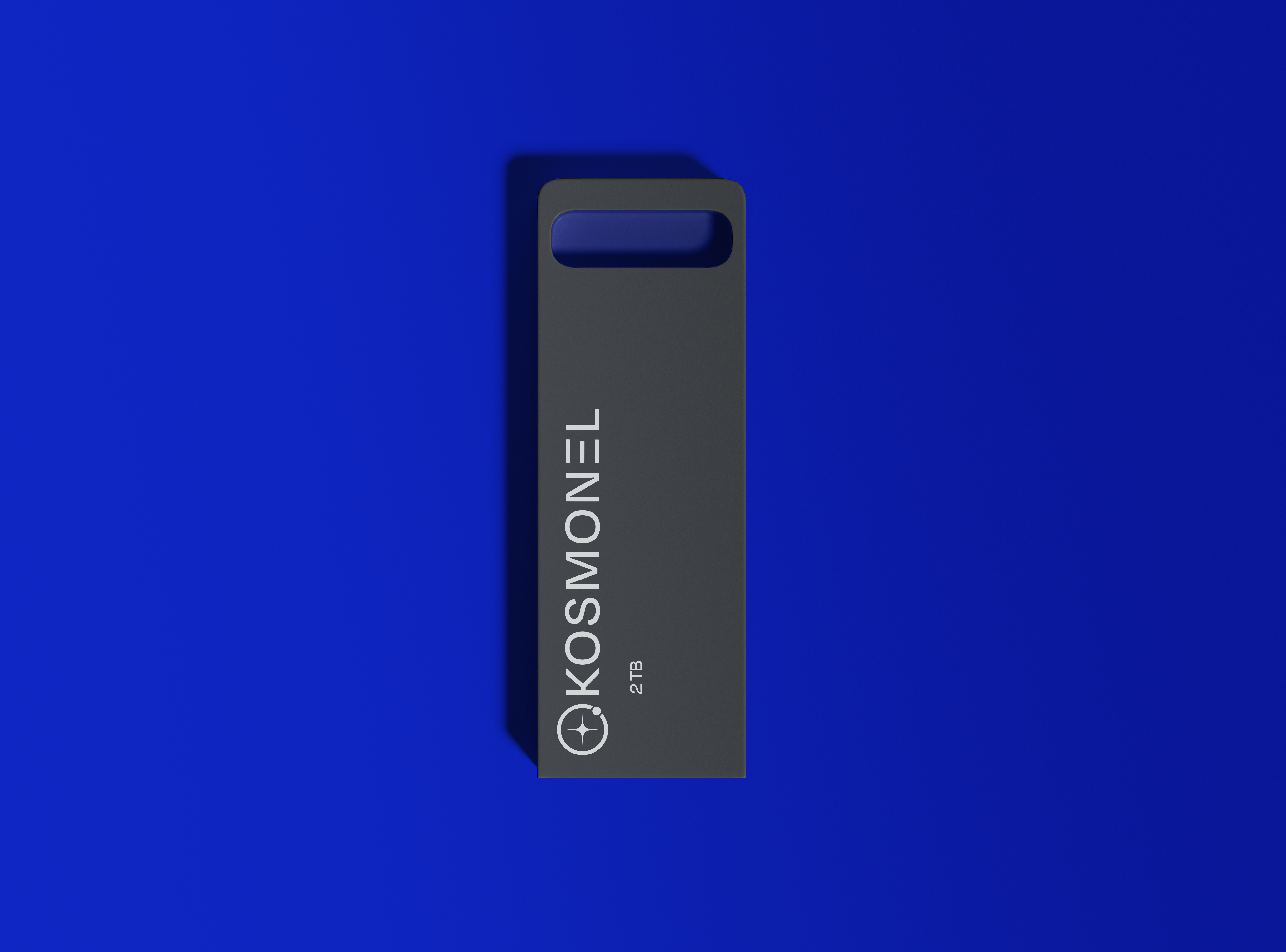
/ The Decision — Electric Blue
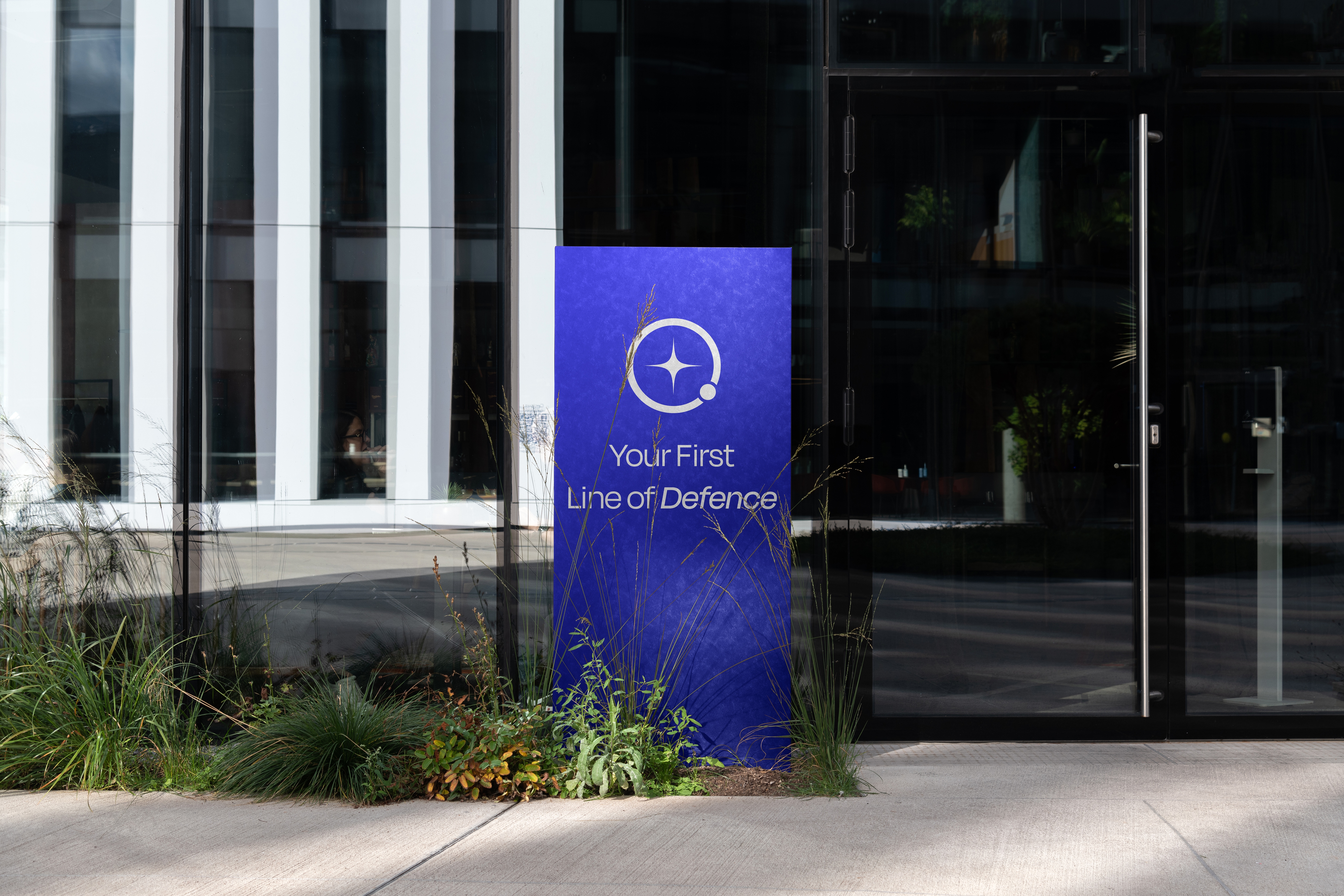
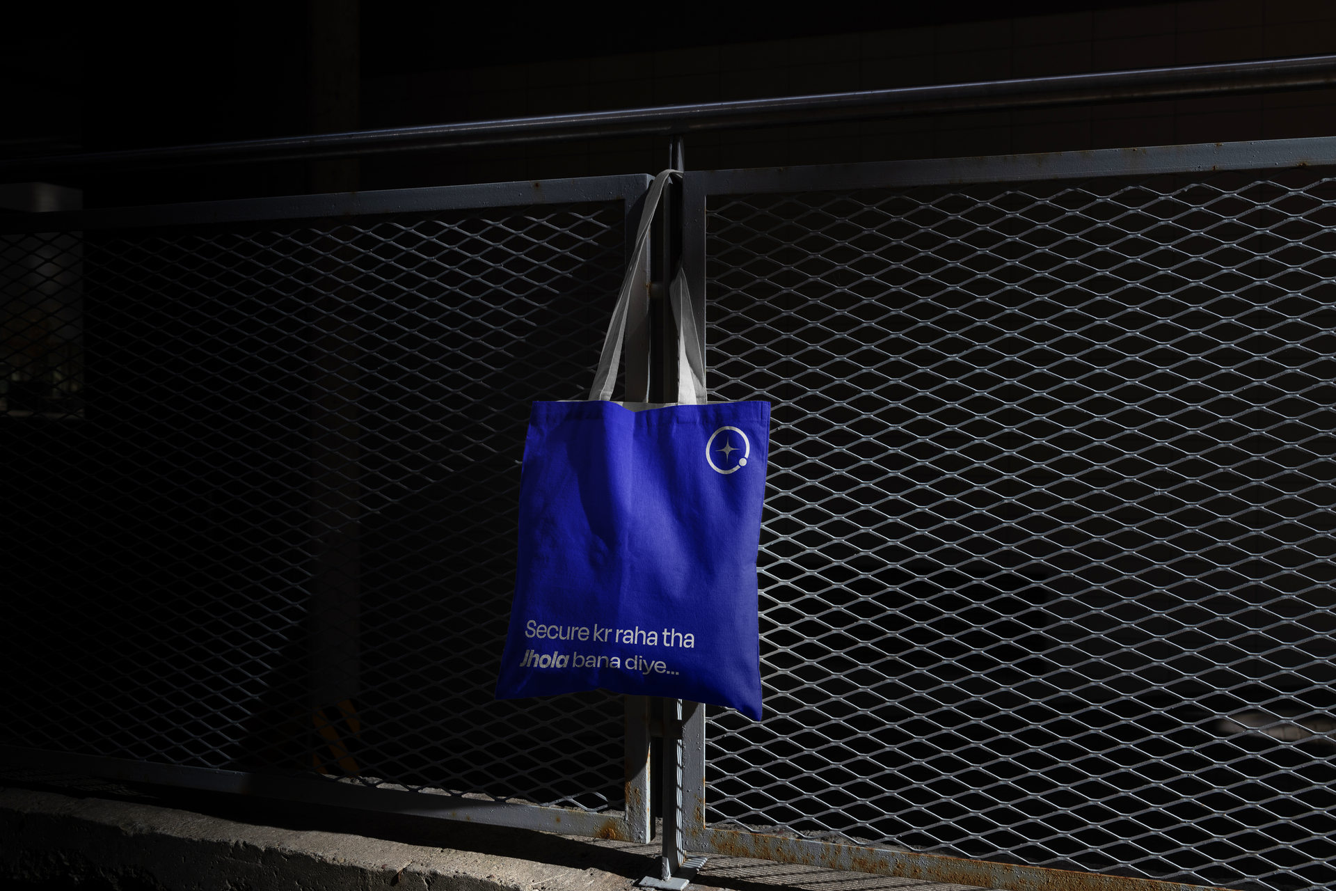
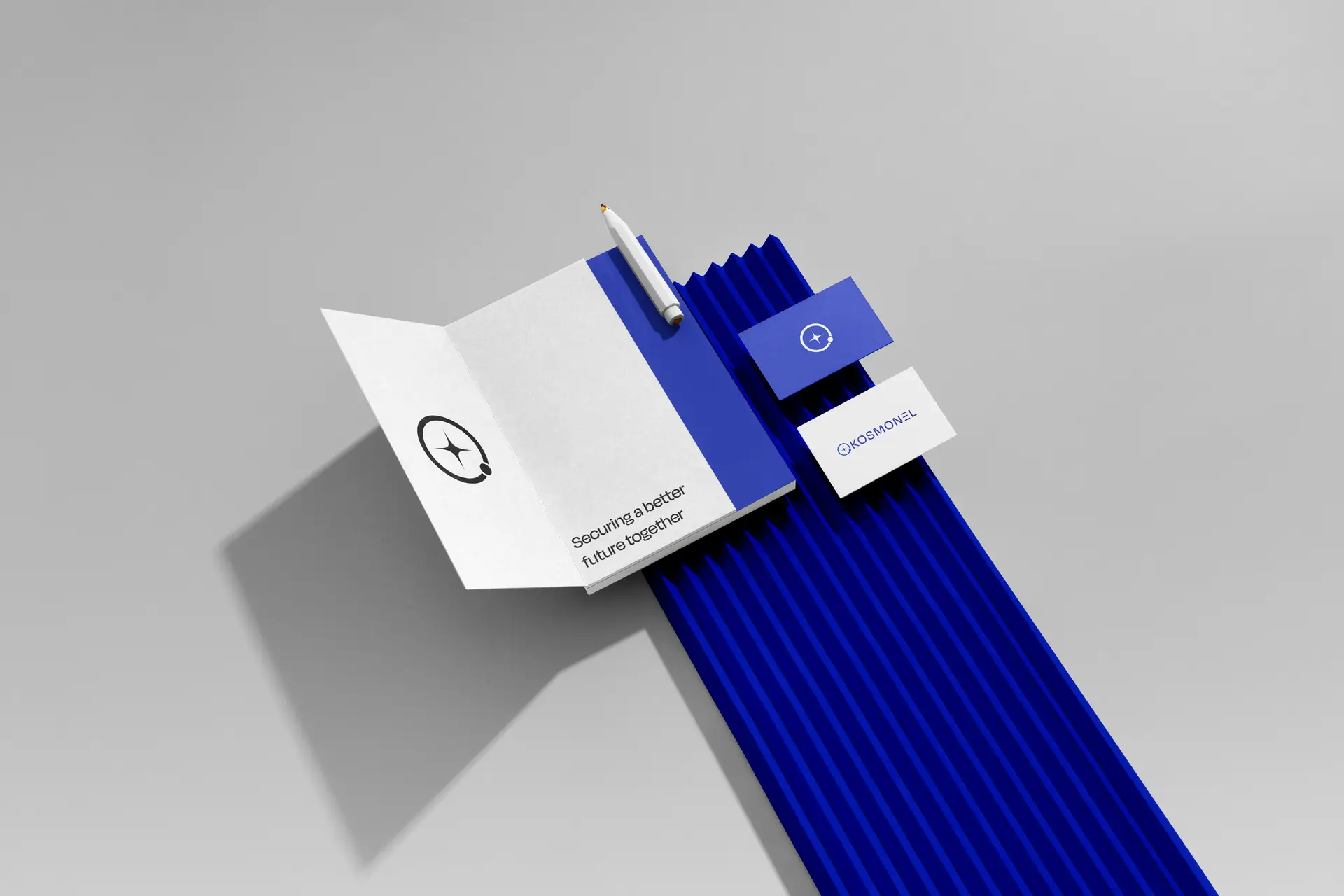
The choice of Kosmonel Blue was not aesthetic. It was strategic. Blue at this specific frequency, saturated, electric, almost aggressive, sits between trust and intensity. It does not whisper security like a bank. It declares it. Against absolute black it creates a visual field that feels like looking at something genuinely powerful. That tension is the brand.
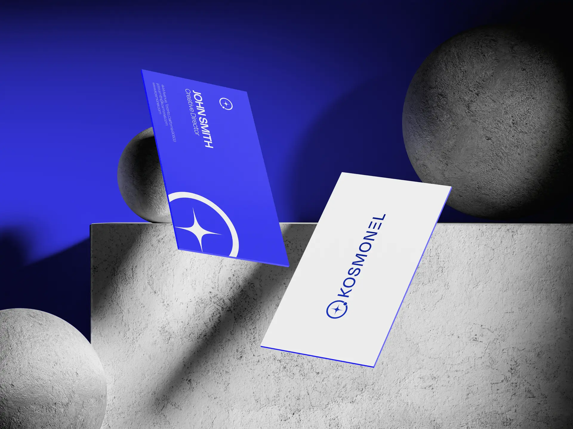
/ Logo Construction
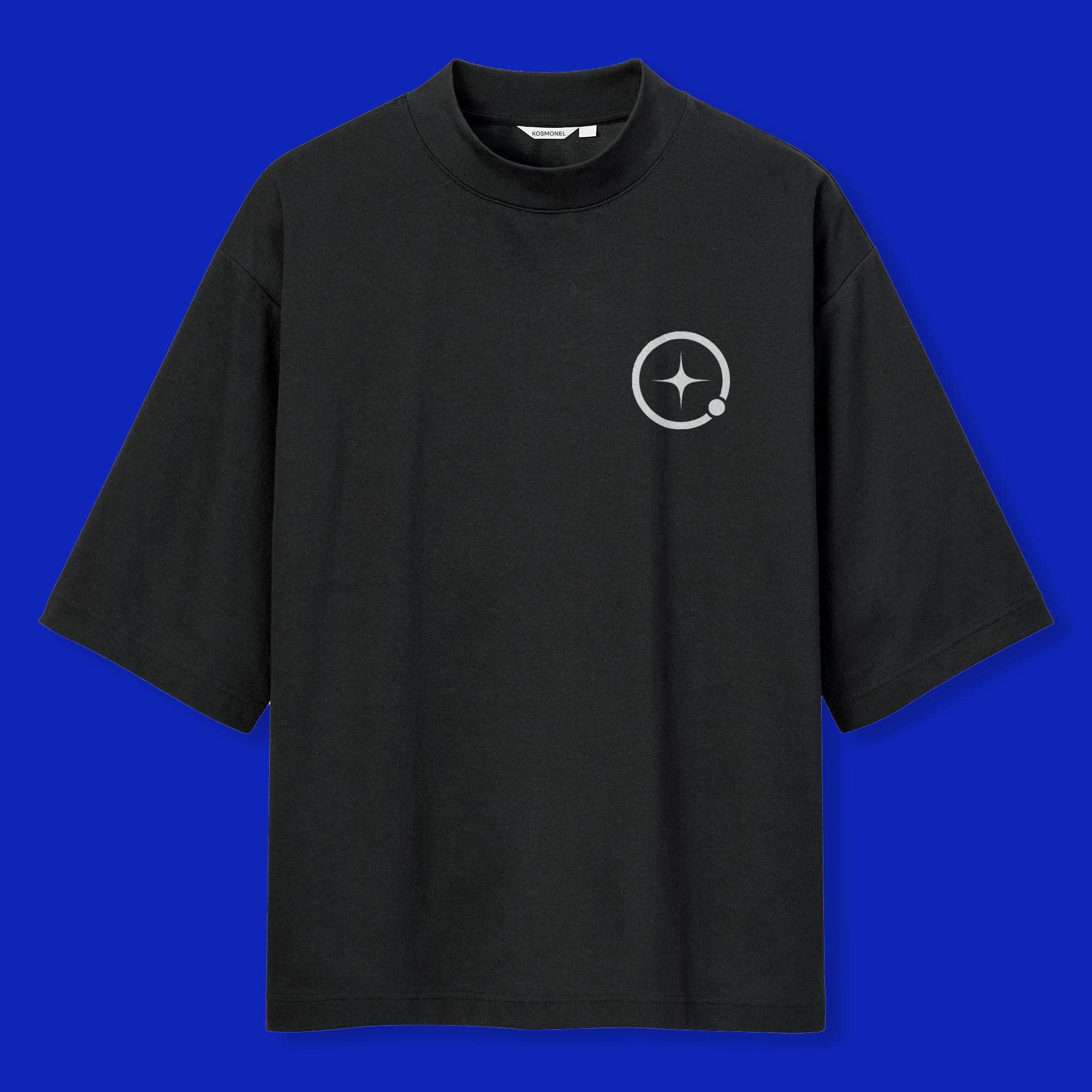
The mark is a four pointed star contained within a circle. Navigation, precision, direction. Built on a strict geometric grid with documented construction logic. The symbol works at favicon scale and building signage scale without losing its integrity. That scalability was a non negotiable requirement from the start.